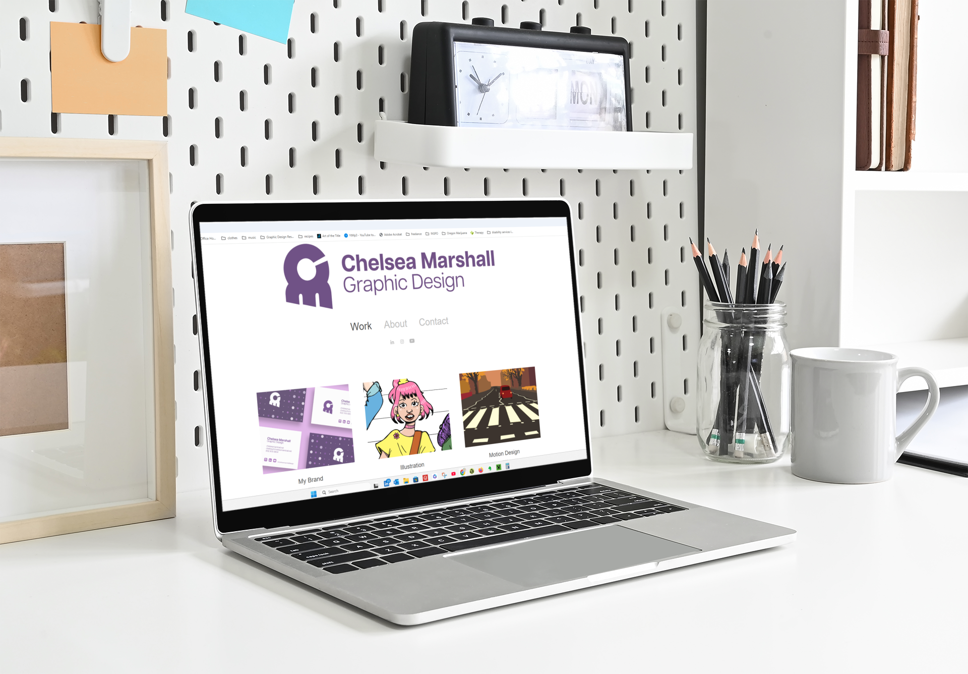
My Brand Identity
2025
Adobe Illustrator
Adobe Photoshop
Adobe InDesign
My professional brand communicates my core values and demonstrates my design sensibilities, emphasizing typography. I design with all people in mind, to contribute to and build inclusivity for marginalized and handicapped people to participate in culture. I incorporate typography with high readability and legibility, a monochromatic color palette, and minimal compositions. This helps me to establish a welcoming experience.

Sketches:
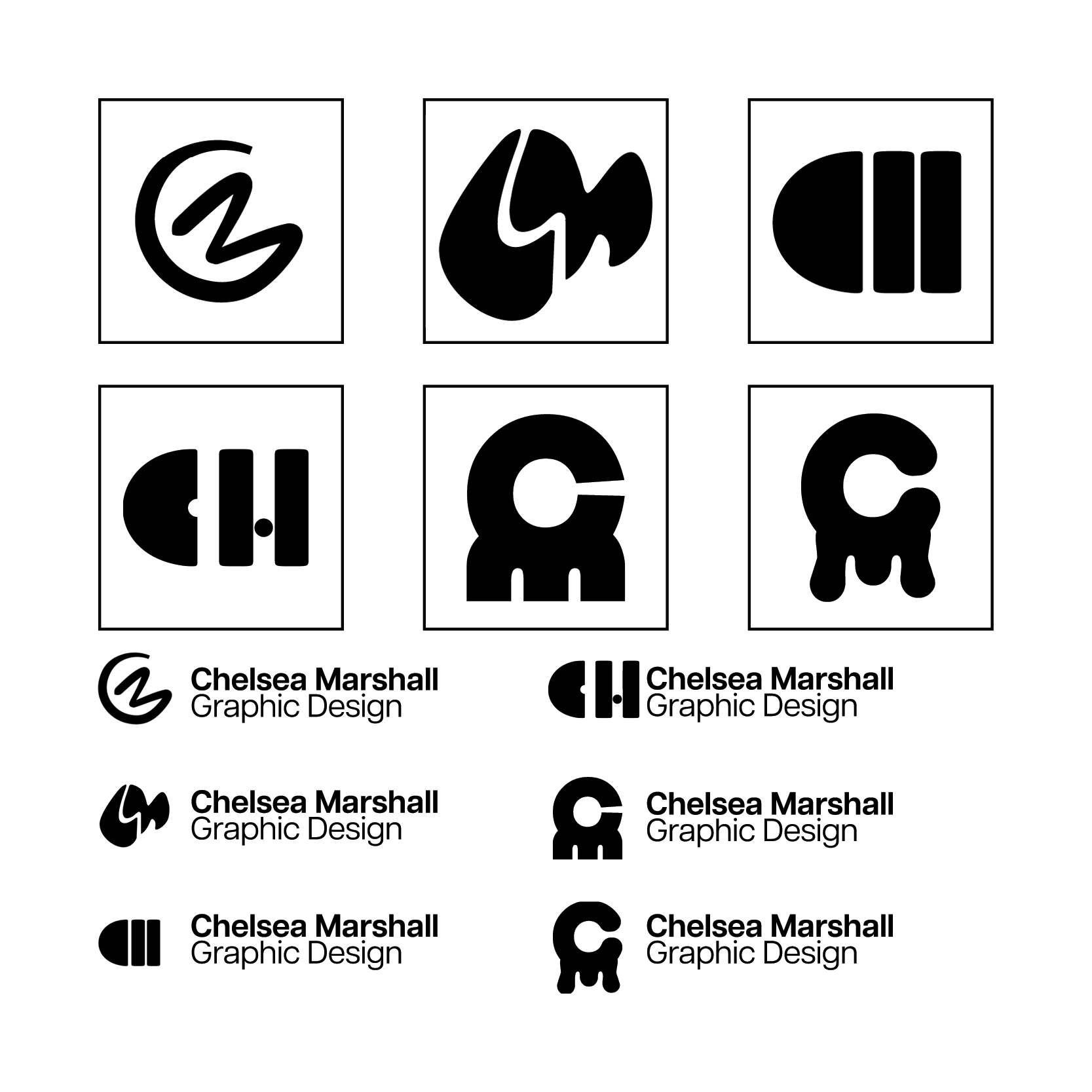
Here are a few of the visualizations I generated in my ideation phase. I experimented with juxtaposing my initials CM to create a unique form. I led this search by exploring illustrative forms and drawing inspiration from abstract shapes.
Digital Drafts:
These are manipulations of the logo sketches I saw the most potential in. While the organically illustrated forms are playful, the geometric forms communicate stability and balance. These drafts explore a balance in functionality and form.

Typography:
Articulat is a clean sans-serif with high readability. I chose this Grotesque style font face with print and web design in mind. Perfect for minimalistic design, this font adheres to the Swiss International Style. With 10 weight varieties, typographic hierarchy can be subtle or dramatic. Heavy is the thickest variety, with Thin on the opposite side of the spectrum.
Articulat is a clean sans-serif with high readability. I chose this Grotesque style font face with print and web design in mind. Perfect for minimalistic design, this font adheres to the Swiss International Style. With 10 weight varieties, typographic hierarchy can be subtle or dramatic. Heavy is the thickest variety, with Thin on the opposite side of the spectrum.
Color:
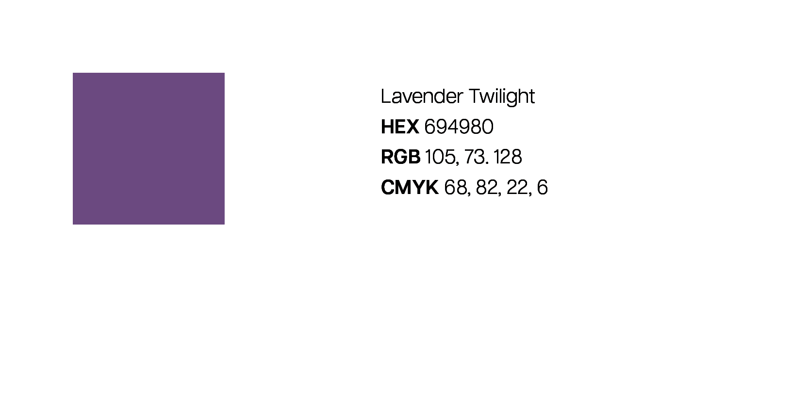
Lavender communicates my nurturing nature. I am sensitive to the needs of others and approach work and life with gentle curiosity. Purple is also a color of royalty, medicine, and spirituality. The monochromatic scheme compliments my personality and retains a professional tone.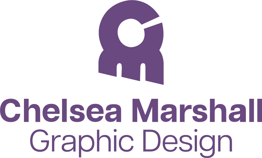
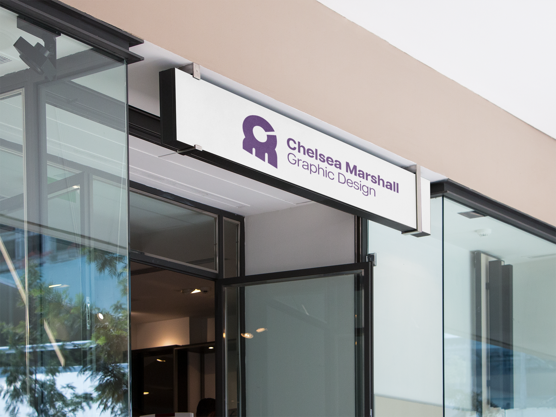
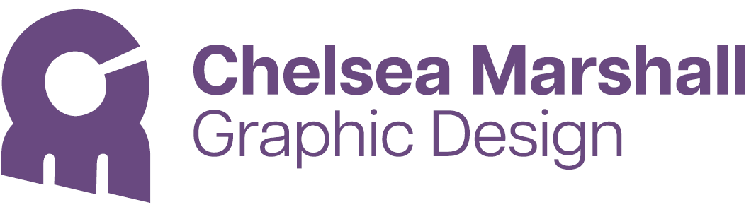
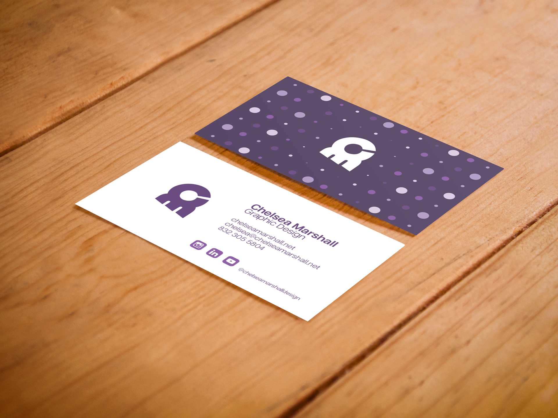
Final Brand Design:
My final logomark is a manipulation of my initials in Bauhaus letters, accompanied by my name and title dressed in Articulat. The circular forms and geometric sensibilities of Bauhaus give my initials stability with the large circle in the middle of the C, while the legs of the M act as pillars. I tilted the C anticlockwise by 30 degrees and made three cuts into the pillars. These opposing diagonal shapes add visual interest and give the eyes a zig-zag shape to follow. The form is still balanced, but it now appears to be in mid-flight.
Avatar Icon
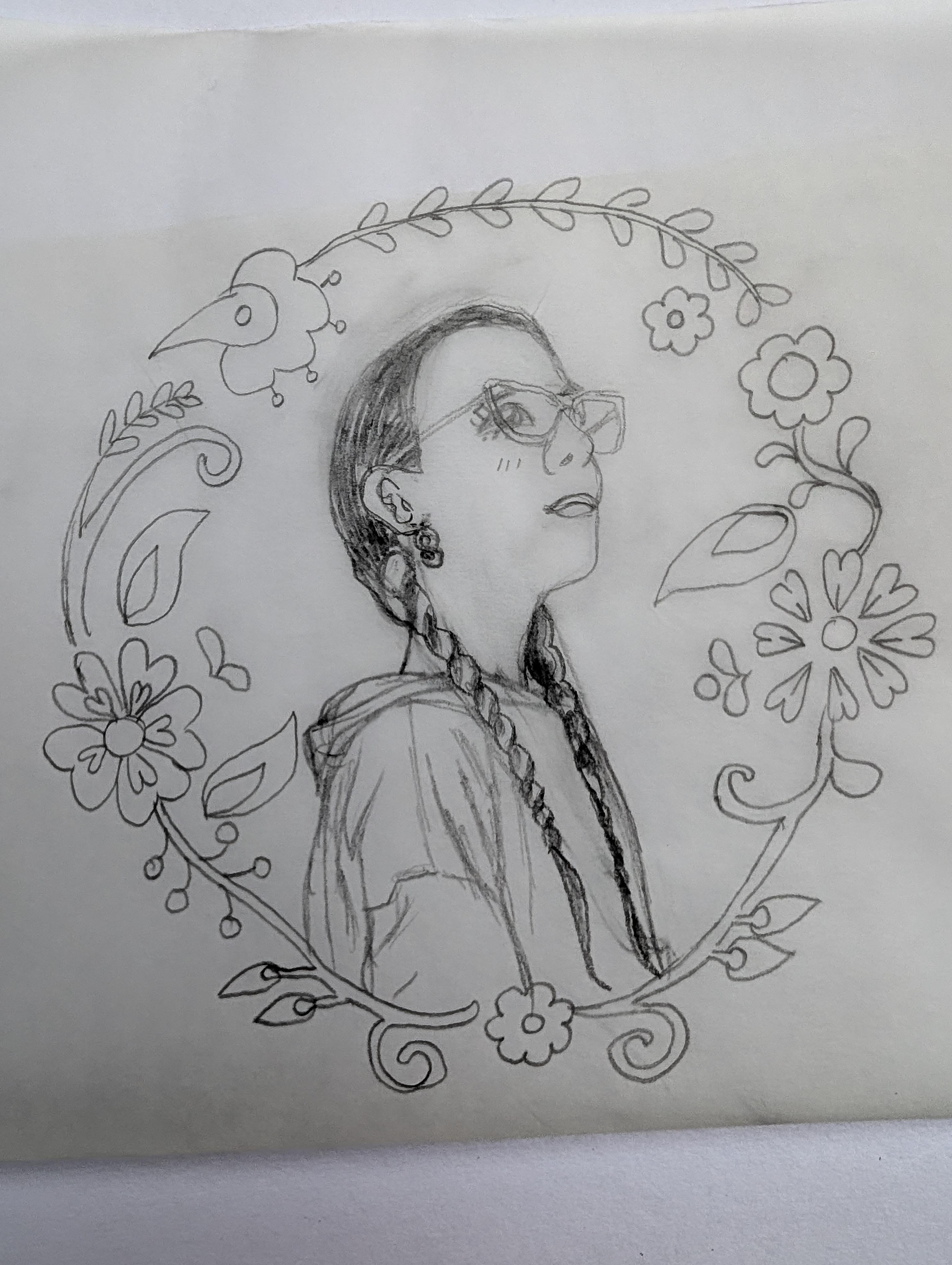
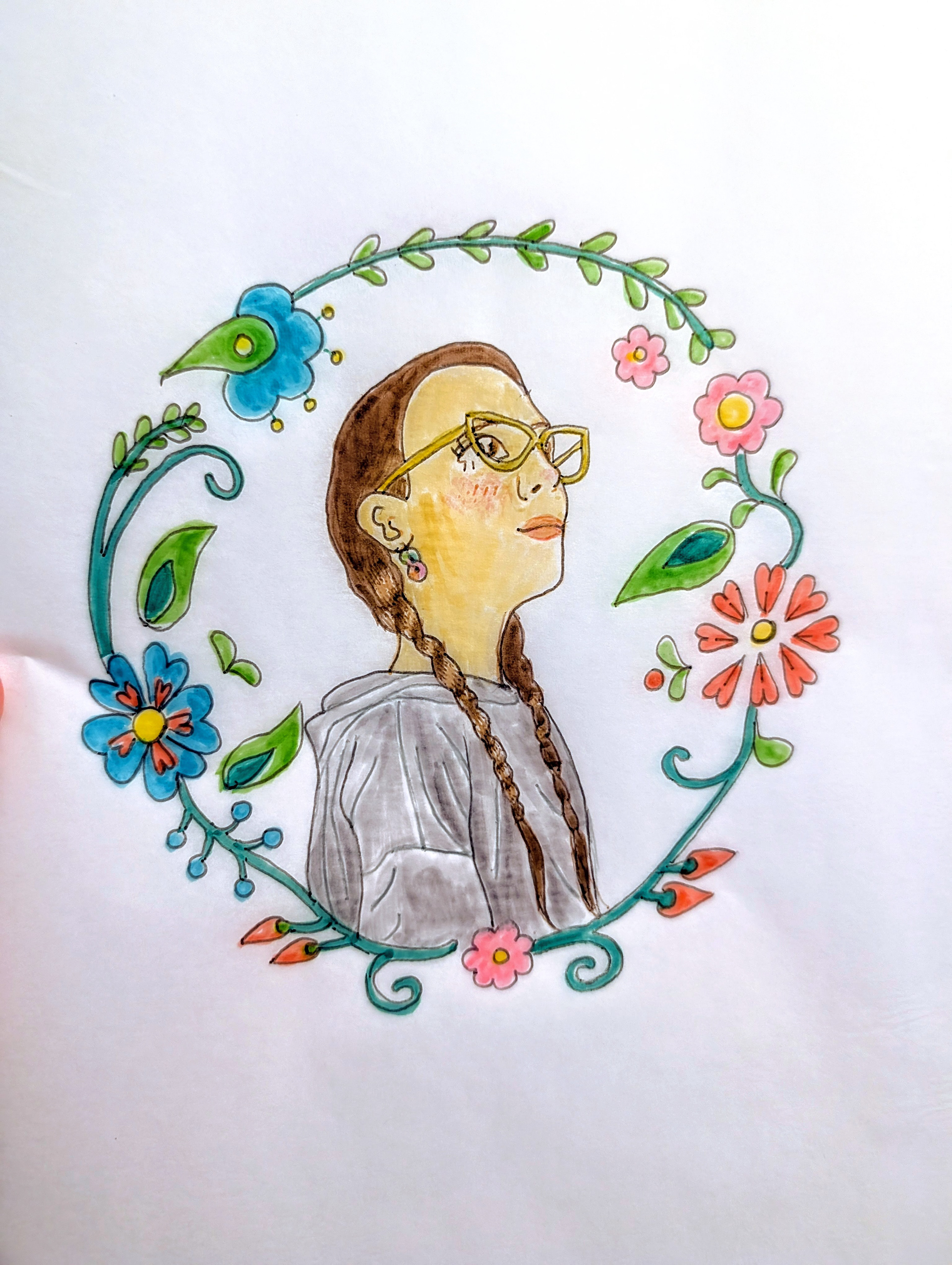
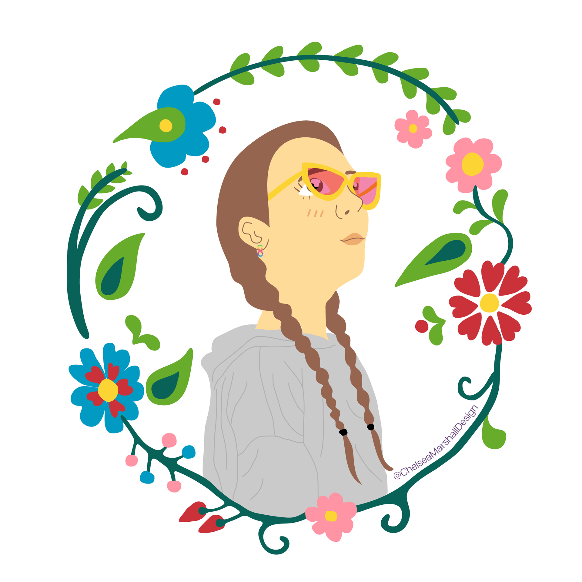
Avatar Icon:
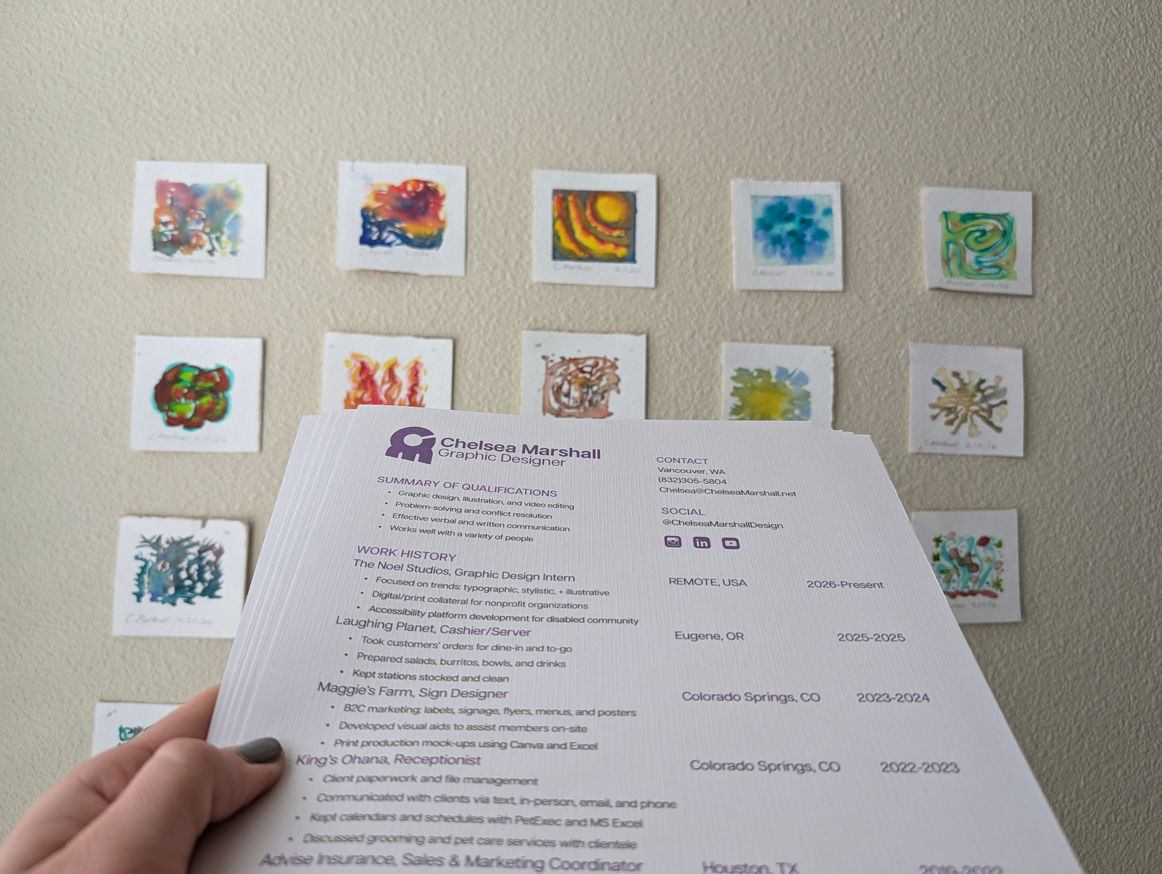
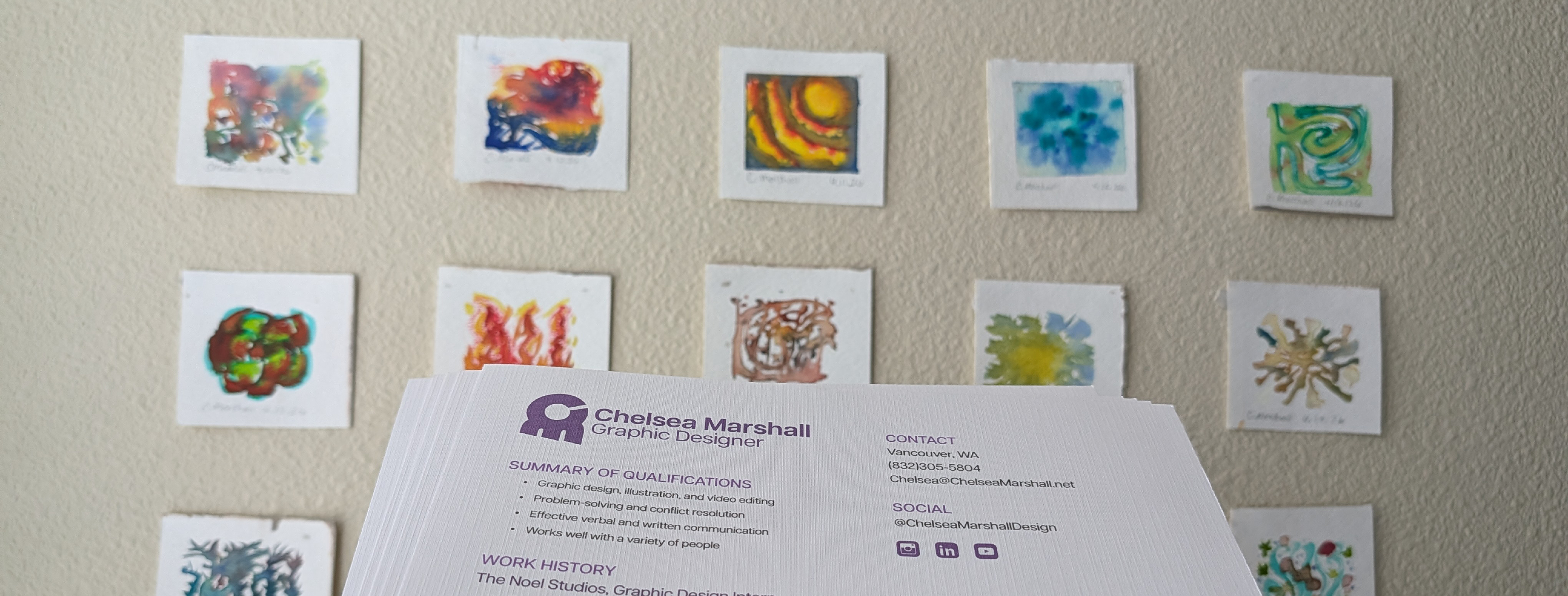
To add a hand-drawn, watercolor-inspired sensibility to my brand, I developed an avatar design with a minimal wreath of flowers, vines, and peppers -- a nod to my interest in nature photography. I am developing a minimalist style with organic shapes, inspired by my outdoor adventures and love for floral watercolor painting.