App Design
2023
Adobe InDesign
Adobe XD
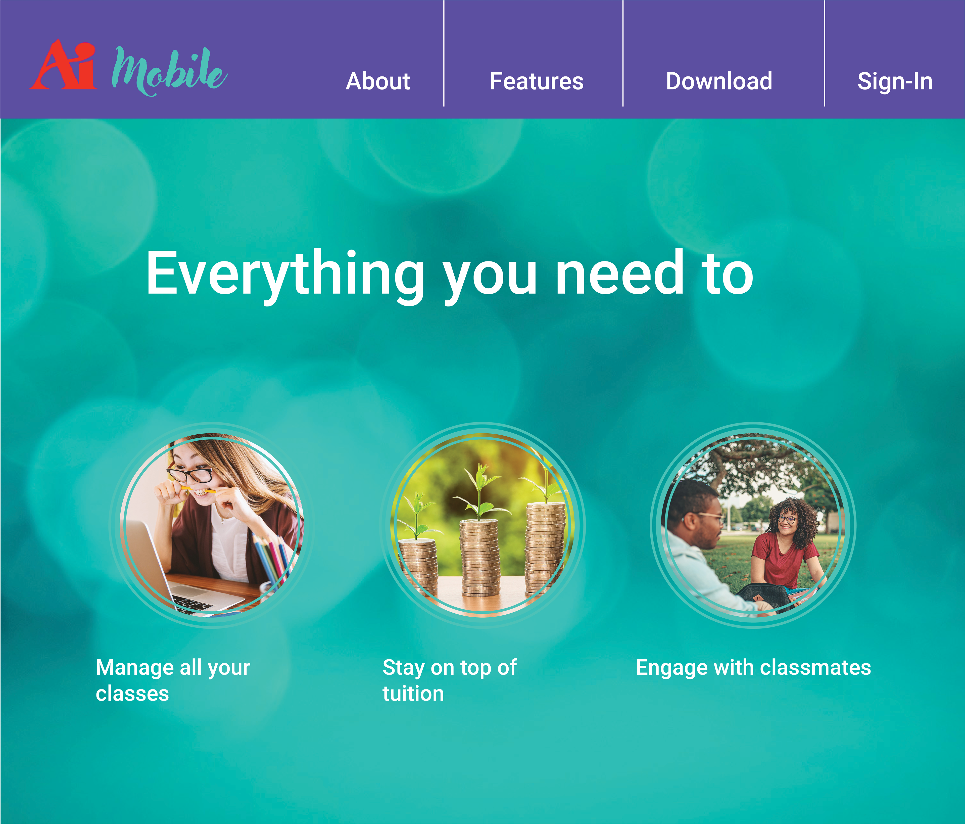
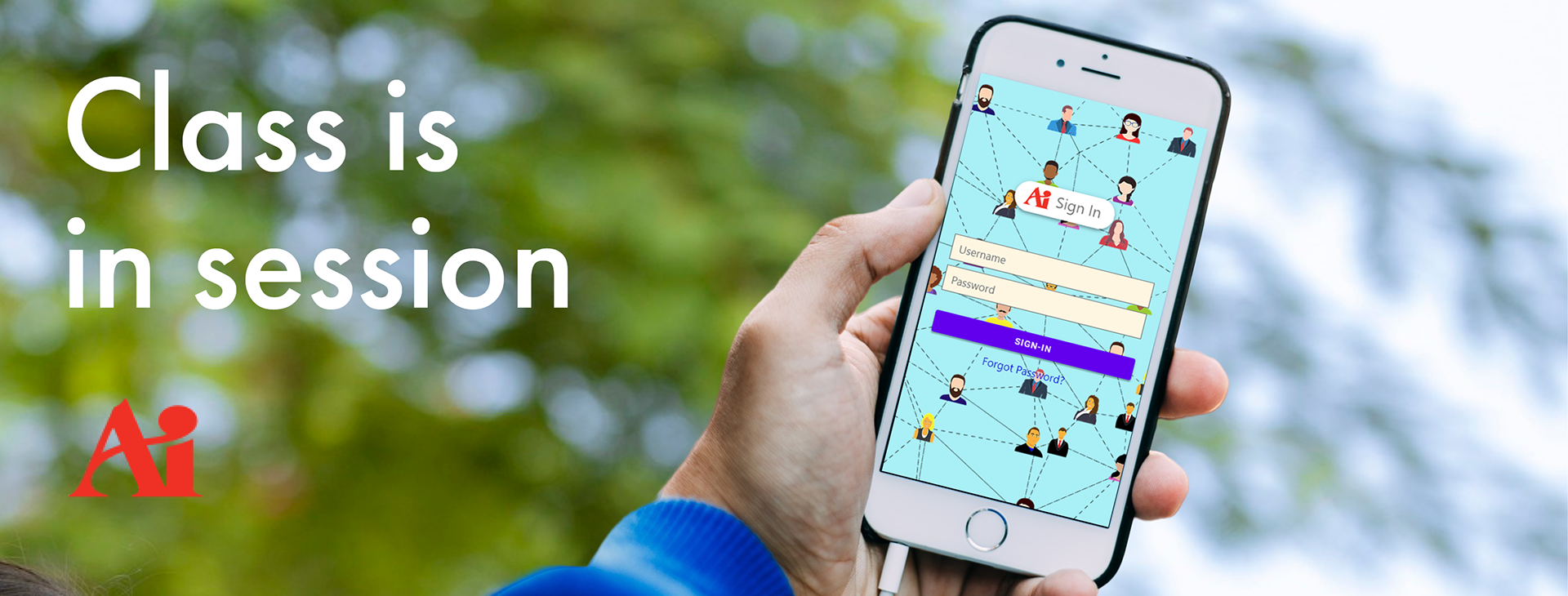
While studying at The Art Institute, I designed a student portal that would help students navigate all of their college needs: from the classroom to paying tuition and engaging in constructive feedback on projects. The interactive Adobe XD prototype can be viewed here.

Concept Sketches:
I created these wireframes in grayscale to establish the layout for each page, which adheres to a single grid. I assigned specific pages and tasks to menu tabs that mimic familiar apps. This makes navigating the app intuitive and straight-forward.
I created these wireframes in grayscale to establish the layout for each page, which adheres to a single grid. I assigned specific pages and tasks to menu tabs that mimic familiar apps. This makes navigating the app intuitive and straight-forward.

Typography:
Futura is a universal sans-serif font-face for web design, which supports a range of weights. This font provides excellent readability and legibility for thousands of tired-eyed art students to read on the go.
Futura is a universal sans-serif font-face for web design, which supports a range of weights. This font provides excellent readability and legibility for thousands of tired-eyed art students to read on the go.
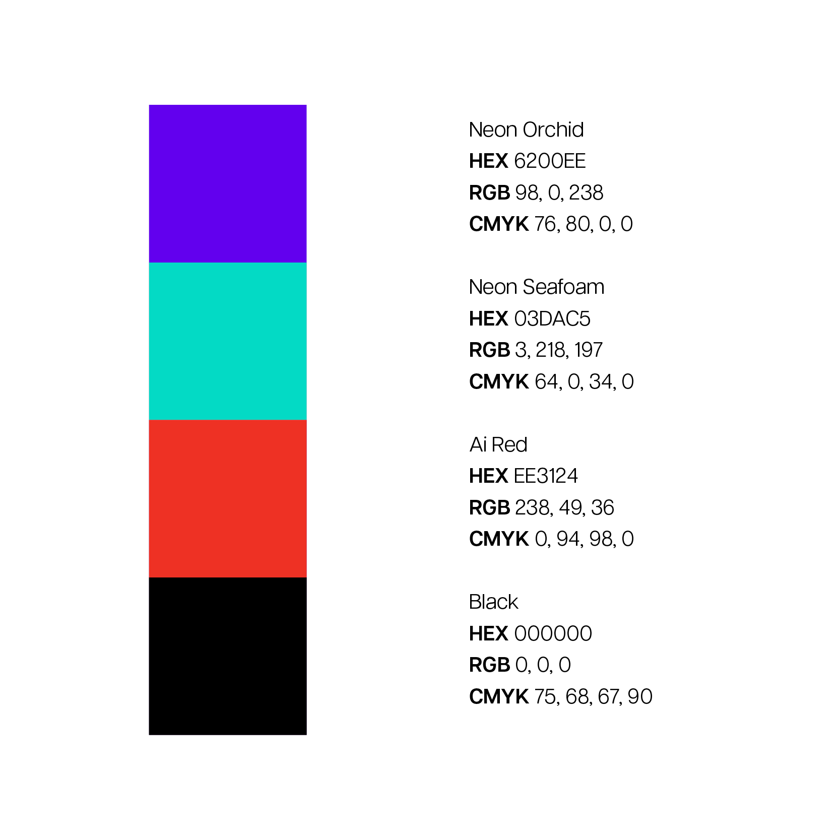
Color:
This high contrast palette functions as color-coding for buttons and widgets in the app. This palette is colorblind safe and the vibrant hues are not overwhelming as buttons on a phone screen.
This high contrast palette functions as color-coding for buttons and widgets in the app. This palette is colorblind safe and the vibrant hues are not overwhelming as buttons on a phone screen.

Digital Drafts:
After receiving feedback on the overall design and formatting, I incorporated our color palette, logo, icons, and imagery.
After receiving feedback on the overall design and formatting, I incorporated our color palette, logo, icons, and imagery.
With the use of grays and plenty of whitespace between elements, visual hierarchy guides the eyes through each page as an organized sequence.
This design considers the needs of people with ADHD, dyslexia, and color-blindness when navigating the online platform. The clear, spacious layouts reduce the chance of confusion and demand avoidance that comes with struggling to process information visually.