Poster Triptych
2026
Adobe Illustrator
Adobe InDesign
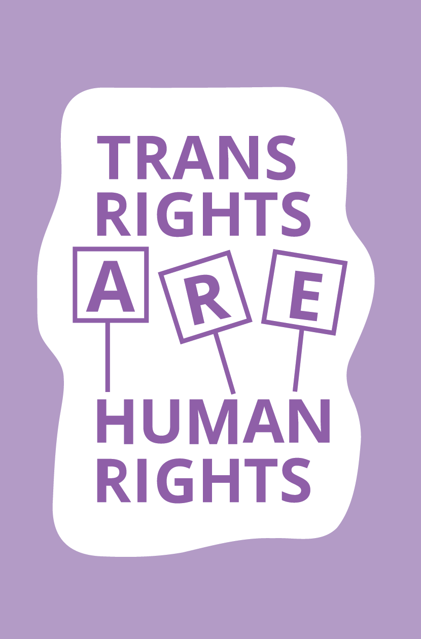
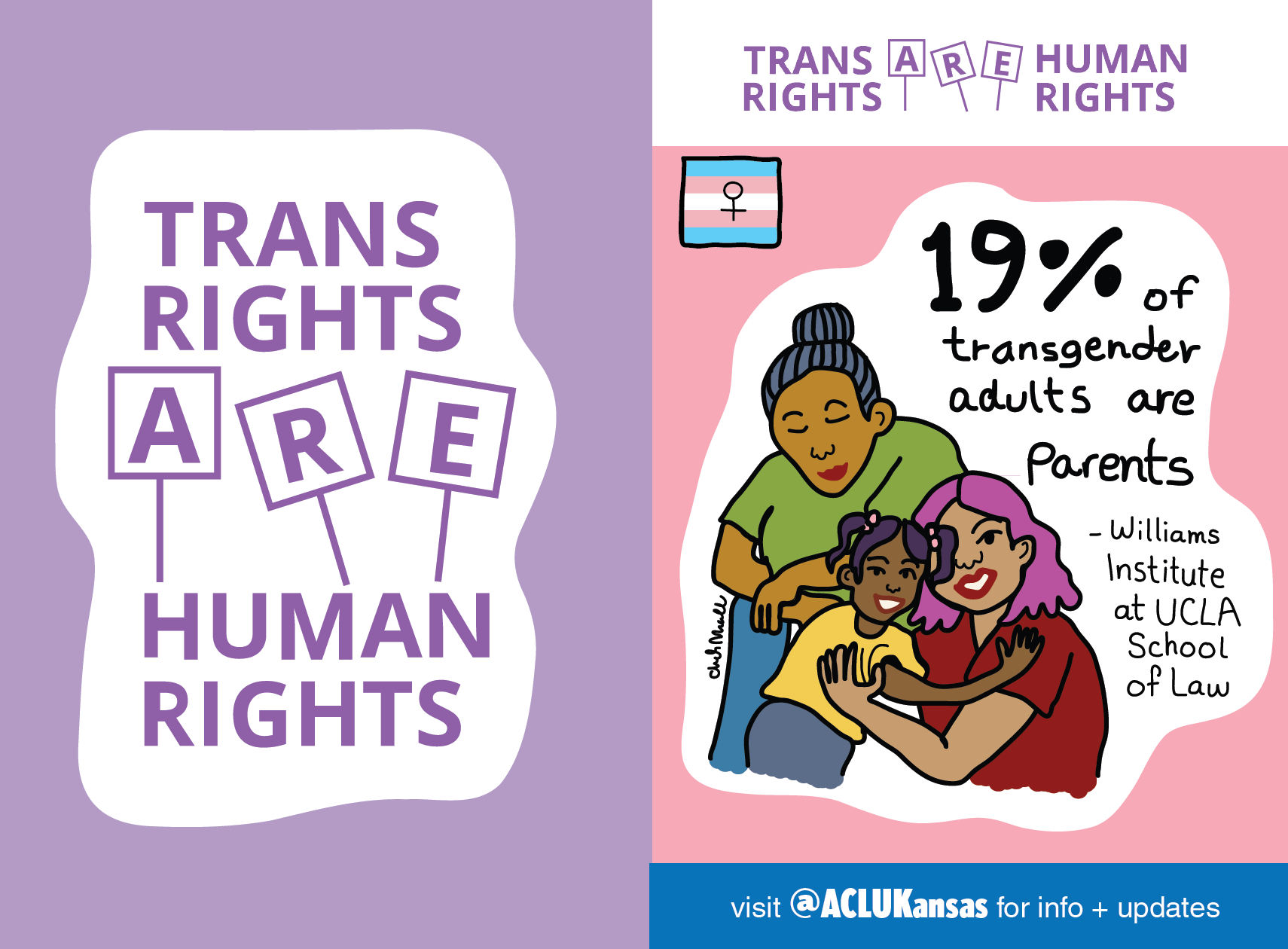
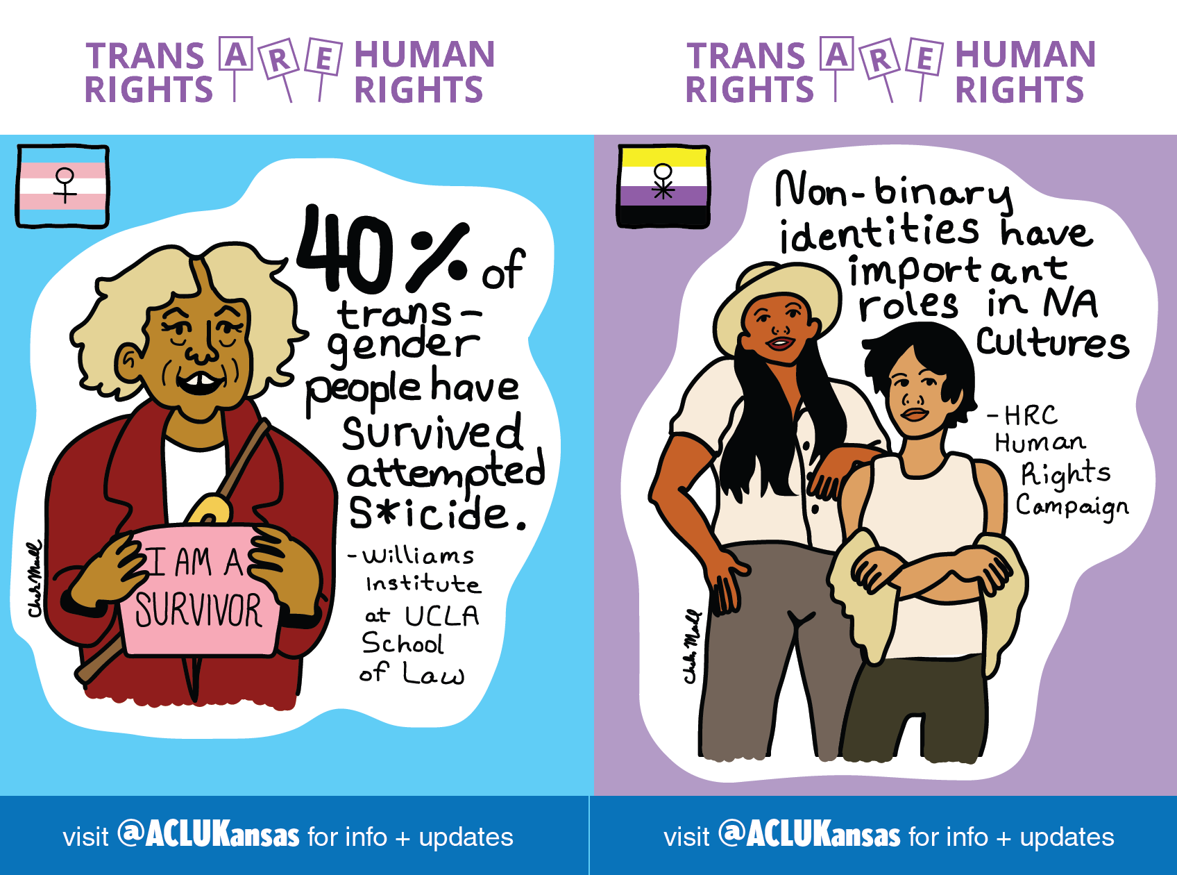
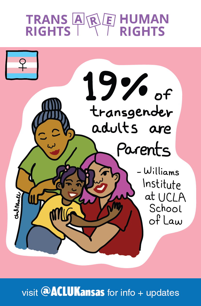
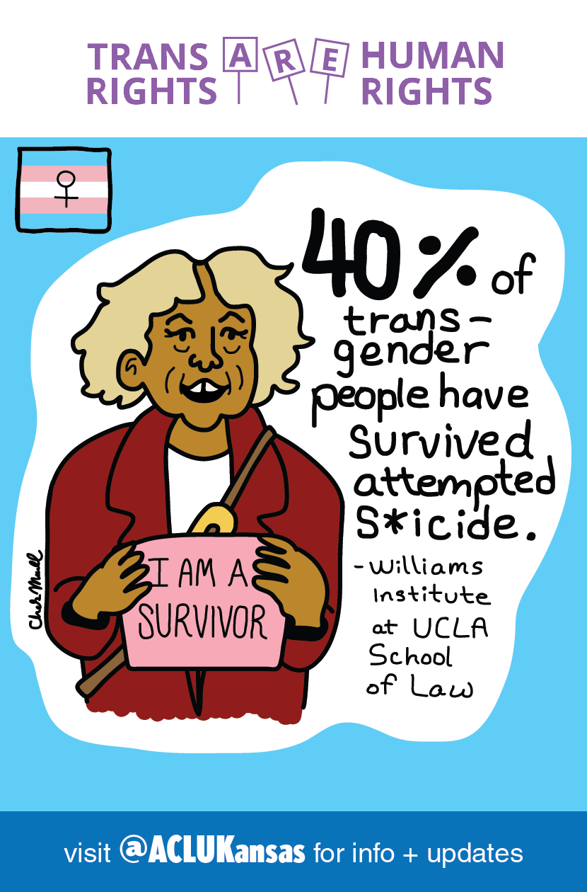
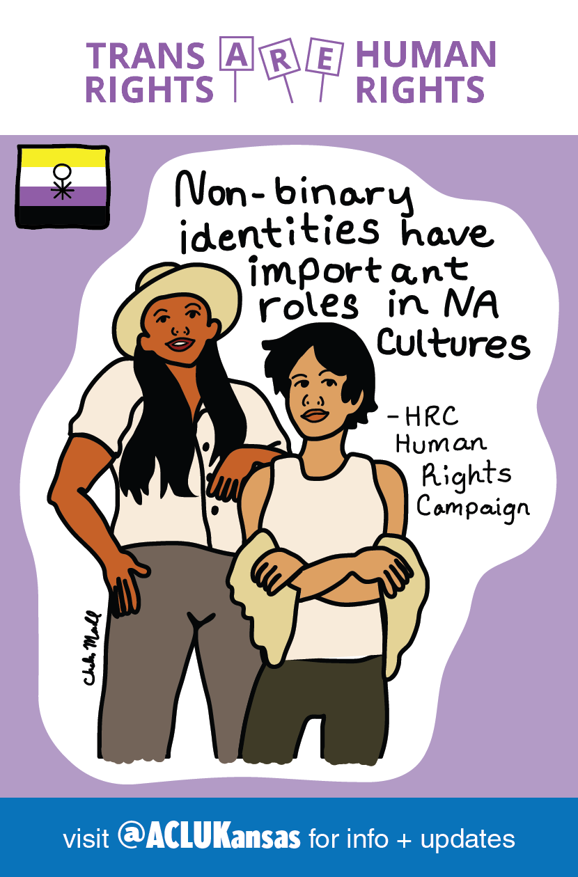
In response to Kansas' Senate Bill 244, I created these posters to highlight the humanity of Kansas' transgender population. The bill has stripped Kansas transgender citizens of their right to vote and deemed their driver's licenses invalid.
For more information, visit:
Target Audience:
Men, women, and alll genders, registered voters, ages 18 to 65, living in a city or urban community. Students, teachers, museum curatorrs, construction workers, lawyers, line cooks, and barbers.
Men, women, and alll genders, registered voters, ages 18 to 65, living in a city or urban community. Students, teachers, museum curatorrs, construction workers, lawyers, line cooks, and barbers.
Research:
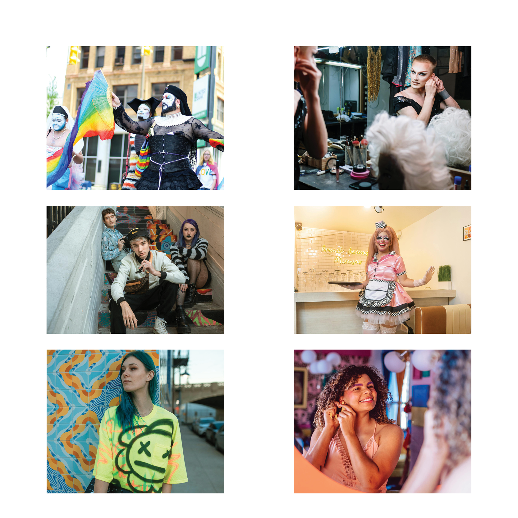
I explored different photographs, symbols, and icons belonging to transgender culture. I considered different combinations of models.
I explored different photographs, symbols, and icons belonging to transgender culture. I considered different combinations of models.
Sketches:
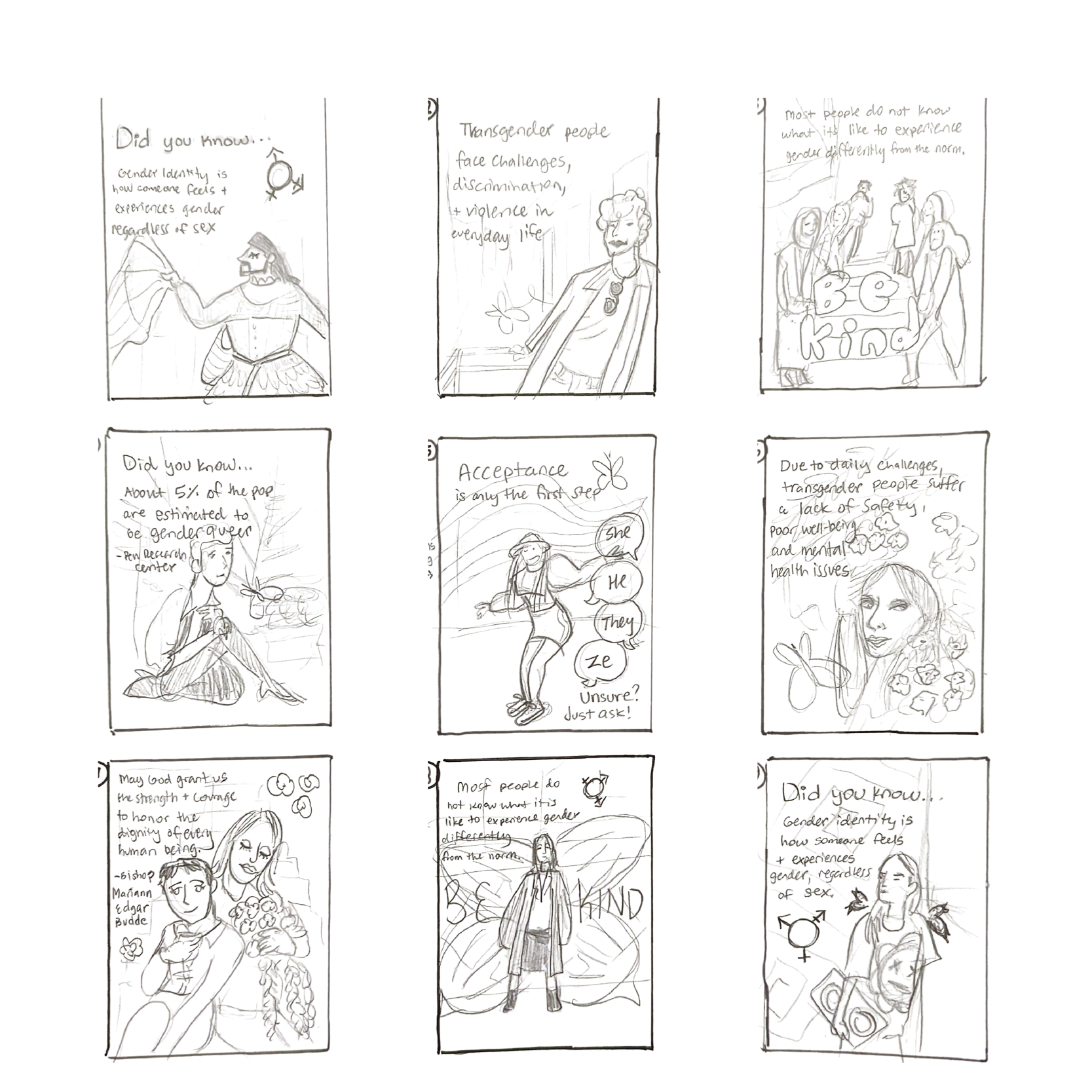
I experimented with placement of elements such as butterflies, the trans flag, the trans gender symbol, and listing their pronouns. The figures in my sketches are inspired by photographs of transgender people. My intent is to convey a person's essence through illustration. I used a variety of transgender models to explore capturing these individuals in their element.
I experimented with placement of elements such as butterflies, the trans flag, the trans gender symbol, and listing their pronouns. The figures in my sketches are inspired by photographs of transgender people. My intent is to convey a person's essence through illustration. I used a variety of transgender models to explore capturing these individuals in their element.
Typography:
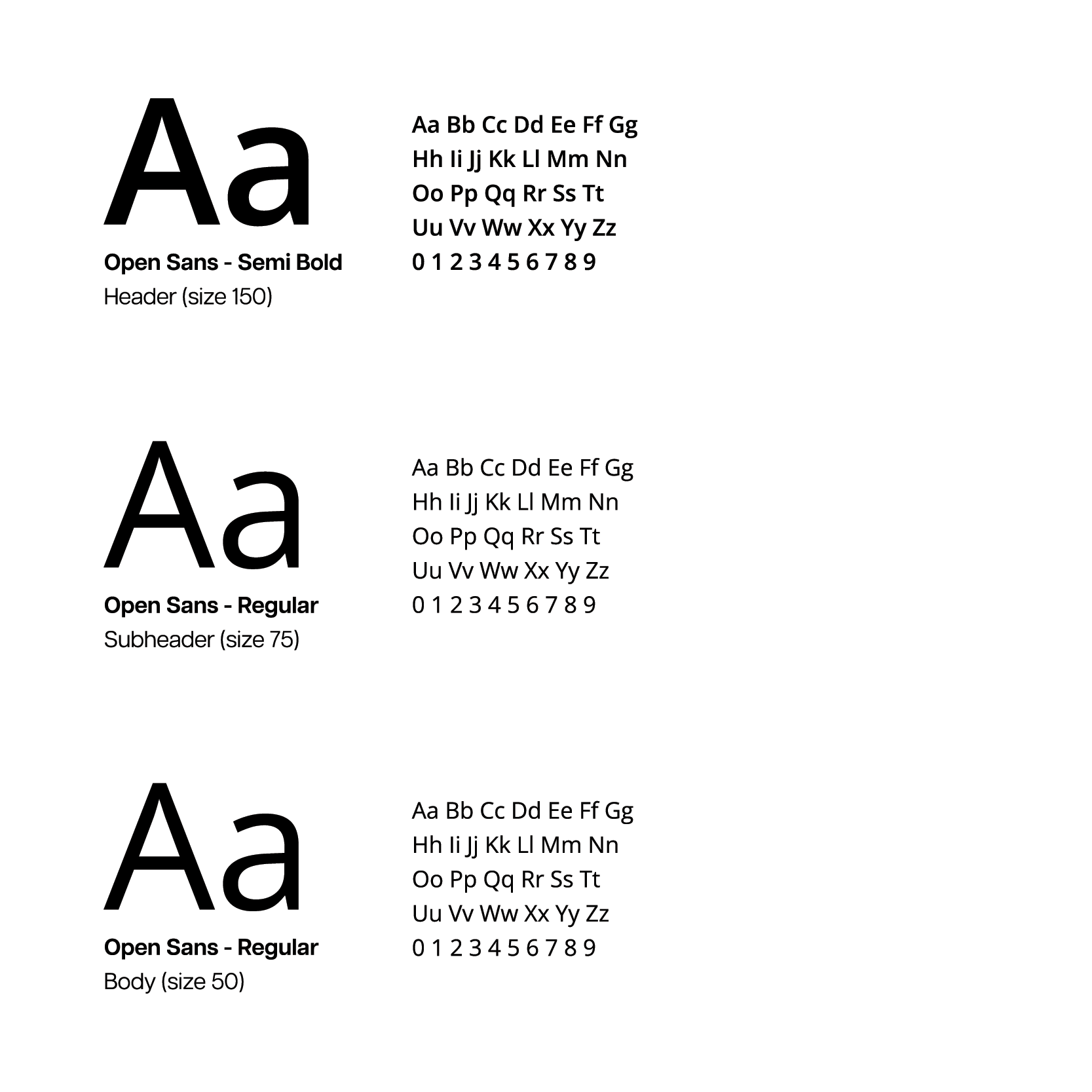
I chose Open Sans for its high readability, legibility, and friendly appearance. This is a no-nonsense font to present hard facts while communicating emphasis on compassion. The elegantly understated curvilinear forms create a friendly font face, which compliments the humanist sensibilities in the illustrations.
I chose Open Sans for its high readability, legibility, and friendly appearance. This is a no-nonsense font to present hard facts while communicating emphasis on compassion. The elegantly understated curvilinear forms create a friendly font face, which compliments the humanist sensibilities in the illustrations.
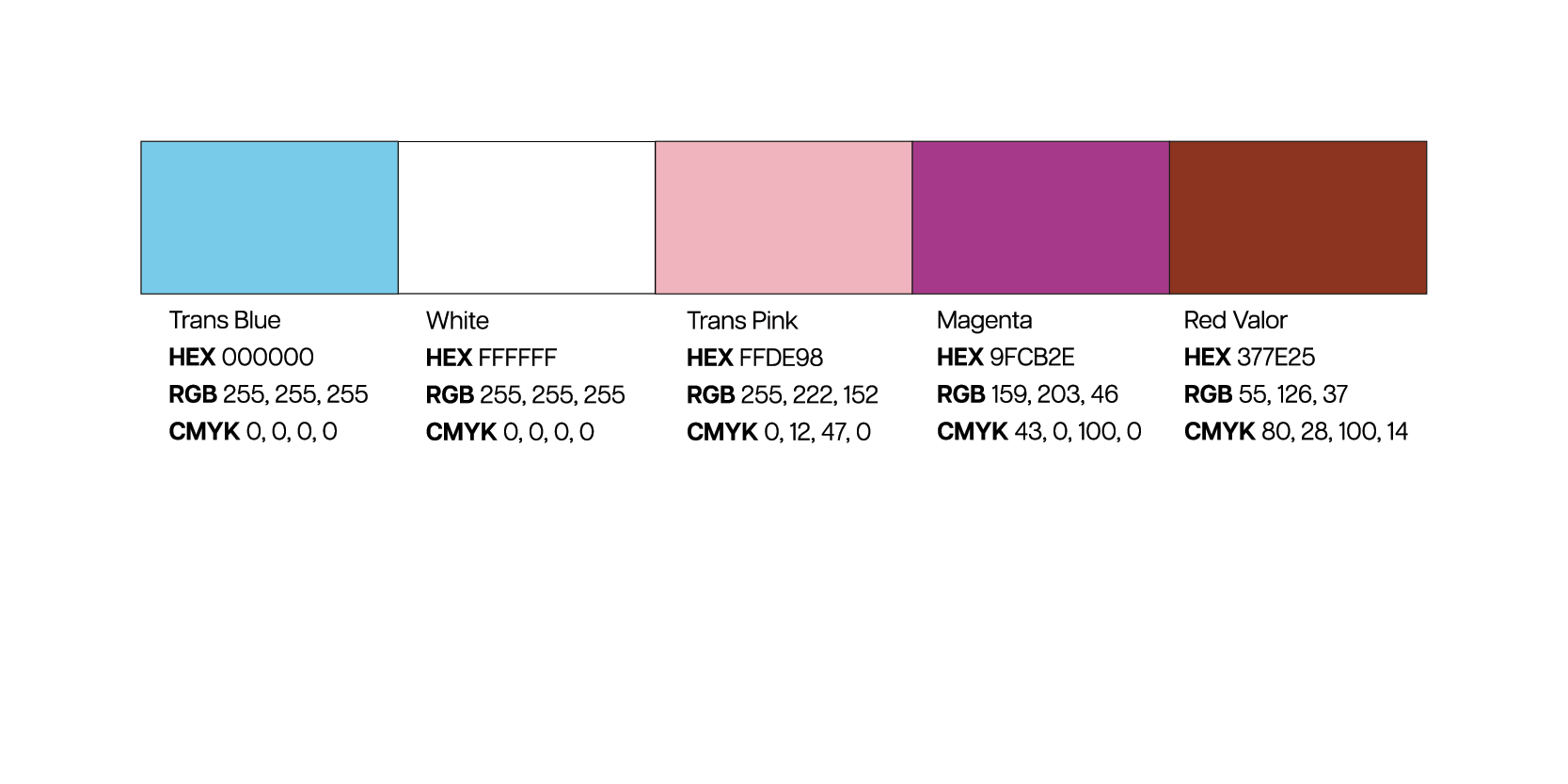
Color:
I started out wanting to make this triptych series brilliant and colorful, however, I found that my digital drafts needed less competing hues. The trans flag colors blue, white and pink appear in each poster to represent trans visibility. Magenta is the brand identity color for the Advocates for Trans Equality.
I started out wanting to make this triptych series brilliant and colorful, however, I found that my digital drafts needed less competing hues. The trans flag colors blue, white and pink appear in each poster to represent trans visibility. Magenta is the brand identity color for the Advocates for Trans Equality.

Final Sketch:
I started with the statistic that 40% of transgender people have attempted suicide. The imagery of transgender people contributing to their communities shows us that these people are resilient and passionate. I included transgender parents, people of color, a senior citizen, and Indigenous non-binary people to remind us of the layers of oppression many transgender people face.
I started with the statistic that 40% of transgender people have attempted suicide. The imagery of transgender people contributing to their communities shows us that these people are resilient and passionate. I included transgender parents, people of color, a senior citizen, and Indigenous non-binary people to remind us of the layers of oppression many transgender people face.
Final:
I expanded on the statistics and created 3 independent designs for the final triptych. Following current graphic design trends in advocacy, I simplified the designs -- carefully removing non-essential elements and brightening the tone. The handwritten lettering adds a softness to evoke peace, gentleness, and compassion.
I expanded on the statistics and created 3 independent designs for the final triptych. Following current graphic design trends in advocacy, I simplified the designs -- carefully removing non-essential elements and brightening the tone. The handwritten lettering adds a softness to evoke peace, gentleness, and compassion.